Thursday, 29 November 2012

How to rig a (Leveson) survey

The Leveson report is released today, but I'm not sure why they're bothering as everybody's already decided  on their favoured solution. The rhetoric has been ramping up for weeks, as newspapers try to apply pressure for light touch (or ideally, no) regulation and those wronged by newspapers in the past, campaign for a tough new regulator.

Guess which side the Daily Mail is on?

I normally try to avoid the Daily Mail website (thanks Kittenblock), but via Twitter today an article caught my eye. Hugh Grant has been doing the rounds with a statistic that 79% of the UK public wants an independent press regulator, with a statutory underpinning.

The Mail says this statistic is "suspect". (turn Kittenblock off for that link...)

I do like a suspect statistic, so let's have a look.


The Media Standards Trust ran a survey that asked:

"There should be an independent body, established by law, which deals with complaints and decides what sanctions there should be if journalists break agreed codes of conduct."
79% agree with that one.

And for The Sun:

"Who would you most like to see regulate newspapers and the press?: A regulatory body set up through law by Parliament, with rules agreed by MPs"
Now 24% agree.

Both polls were conducted by YouGov. What the hell?


The Daily Mail says that:

The key to the MST [Media Standards Trust; the 79% one] poll result is the use of the word 'independent' in the first question but not in the second.


True. The Mail's spun that statement heavily though, because although the second question doesn't say "Independent", it does say, "with rules agreed by MPs".

Both sides have rigged the question in their favour, by using wording which emphasises the positive or negative aspects of a statutory regulator, depending on their own point of view. The Media Standards Trust plays up "independent", while The Sun draws attention to potential political interference with a free press.

As much as I hate to say it - because personally, I do think we need a statutory underpinning - the Media Standards Trust question is probably worse than The Sun's poll, because it suffers from acquiescence bias. This is the tendency for survey respondents to answer positively to a question that asks for agreement.

"There should be", invites a strong, positive response. Disagreeing requires more thought and a stronger opinion than saying, "yes, ok, that's probably true."

The huge difference between responses to these two questions illustrates the enormous difficulties present in polling on emotive issues and the ease with which a survey can be rigged to produce the answer you want. Vic Reeves famously said, "88.2% of statistics are made up on the spot". He was wrong though - you don't need to make them up. Ask the right question and people will give you the answer you wanted.

Here's how it's done by a pro. I know I've linked this before, but it's brilliant.


Tuesday, 30 October 2012

Advertising missed the point, it was never about analysis.

I reviewed the book Moneyball ages ago. It's great. Read it if you haven't already.

I'd like to revisit that book today, even though it's old news now and we've all moved on to talking about new shiny things from Apple and forgotten why a small baseball team from Oakland keeps beating bigger baseball teams. I'm going back to it, because it seems to me that advertising spectacularly missed the central point of the book. And the central point of Moneyball is potentially incredibly valuable to what we do.

When it read Moneyball, the advertising industry heard: "Analyse lots. If you do lots of analysis, you'll win more." After all, the Oakland A's baseball team hired a team of analysts and then they performed much better.

Which is wrong.

That's like saying if you want to go to Edinburgh, drive your car around a lot, because it's possible to drive to Edinburgh. It's not a massive amount of help until you work out which way you're going and just driving in circles will cost you a lot in petrol.

It's all about the question again. It's always all about the question.


The early analysis done by the Oakland A's was really nothing special - almost back of a fag packet stuff - but they'd asked the right question. That question was, "how do we compete, when we have less money than other teams?", which is itself too general to guide an analysis and quickly moved towards, "which players are undervalued, in terms of their ability to win us a baseball game?"

From there, your analysis lines up very quickly:

Which attributes of players help you to win baseball games?

Which players are good at those things?

So, which players have a cheap price tag, that doesn't reflect their ability to help win games?


Moneyball is all about looking for market inefficiencies. It's about discovering factors that are important in winning a baseball game, but which your competitors undervalue and then buying up cheap players who are good at those things.

We don't do that type of thinking very often in advertising.

We assume, over and over again, that the way to stay ahead of the competition is to innovate first and to be the first into an emerging media channel. Mobile, social, video pre-rolls... whatever is flavour of the month. The trouble is, with everybody doing that, demand for emerging channels will be higher and the price will be pushed up. It's basic supply and demand.

With lots of companies chasing after emerging media channels, their price is almost certainly inflated vs. their effectiveness. If you consider that new channels are risky because we don't know if they work yet, the problem gets even worse.

So where would the advertising market inefficiencies be, if you went looking for them? Which channels work better than their price suggests? I'm willing to bet those inefficiencies are in the same place as they were in baseball - they're in older, unfashionable channels just like they were in older, unfashionable players.

Players who can't do every job, but are still very, very good at one job. Other inflexible players can then be brought in to cover their deficiencies and overall, you'll have a very effective team. Or, alternatively you can go for a very focussed game-plan, based around the limited skills that your players do have.

I'd be willing to bet that it's the unglamorous media channels, which are undervalued in marketing. Leaflets... emails... daytime TV... You know, the channels that tend to get used by companies with small advertising budgets, who punch above their weight and who keep a very close eye on marketing efficiency. The companies with 'limited' but very focussed media plans.

This article from a few weeks ago also pointed out that in the US, the over 50s control 75% of financial assets and yet we pay a premium to target younger consumers with advertising. Yes, younger people are harder to reach, but they're so much less valuable in terms of spending power that I'd be amazed if there isn't an inefficiency here for somebody to exploit.

It's hugely cheaper to market a product to the over 50s and they're the ones with all the money. It's not glamorous advertising, but then the Oakland A's didn't have glamorous players.

They had effective ones.

Thursday, 25 October 2012

Measuring social: Even Q couldn't do it.

I'm sure you've seen this video from Coke Zero. It's brilliant.


Best example of a marketing viral I've seen in ages and I'm sure the Coke Zero social marketing team are giving themselves well deserved pats on the back.

This one's going to turn up in every "how to do social" slide deck that gets produced in the next 12 months. It's a rare example of a social campaign where nobody's going to argue with the value. Any marketer would be proud to have it on his CV.

But what if finance got awkward?

What if they insisted you'd never be allowed to pull a stunt like this again, unless you could prove it sold some bottles of Cola?

Well then you'd have a problem.

I've posted before that for a variety of reasons you've got virtually no chance of linking social media activity to sales. Actually, let's rephrase that. There are hundreds of ways to imply a link, but it's virtually impossible to prove a link, mostly because it's hard to get good audience data on who saw the viral and when they saw it, plus any positive effects it has on sales are likely to build up slowly, so looking for an immediate spike won't work.

We've all seen loads of 'how to measure the ROI of social' articles, which then spend five hundred words avoiding the question, but for once, I'd like to hit that question head on. First of all, for ROI in terms of additional sales, forget it. Even if you've got sophisticated econometric models in place you'll be lucky to pick up the effect. So here's what I'd do.

Your answer is going to need a £ figure in it, because you're talking to finance. Loads of Facebook shares and positive Twitter sentiment isn't going to cut it.

That YouTube video's got 3.8m views, so line up your social campaign vs. the alternatives. How much would it cost to run a TV advertising spot that achieved 3.8m impacts?

Actually, not that much. In the UK, take an average adult cost per thousand impacts on TV of £5 (ish) and you're looking at an equivalent value of... £19,000.

Damn, that's not very impressive. Probably not enough.

Say you can show that the audience for the YouTube vid is a bit better than a blanket "adults" target. That it's younger and would be harder to reach with TV. That wouldn't be difficult; if nothing else, you could show that YouTube users in general are younger and so your viral audience probably is too.

Now you might be able to justify a cost per thousand of around £50, rather than £5 because hitting younger viewers with TV spots is expensive. Your equivalent media value is £190,000. Better.

But hang on, that video is two minutes long, not the standard 30" TV spot. Four times the spot length, gets us to a value of £760,000.

That's more like it.

It's also more good evidence for why you'll struggle to measure a social media effect on sales. A global TV campaign for Coke with a budget of £760,000? Don't make me laugh. It's a drop in the ocean.

Once you've got a nice solid financial number, you can layer on some softer metrics, always referring back to  what it would have cost you to expose that audience in a different way. Did you gain Facebook followers? Great. They're valuable because you can talk to them again, rather than spending money somewhere else.

Shares on Twitter? Careful, those people are already in the YouTube plays number.

New followers on Twitter? Lovely, just like the Facebook ones, they have a value because now you can show them more advertising messages.

The last step you might want to try is that direct link to sales. You won't be able to prove it (I might have mentioned that) but you can imply it. If there's a general ROI to TV circulating in the business then you've just put social in the same space as that media, so you can potentially borrow it. How many sales would a TV campaign of that value have generated?

You might also be tempted to make the case that somehow Facebook advertising messages, or YouTube video views are 'better' than TV spots - that they're more engaging and with higher impact - but be very, very careful. You're doing this exercise for finance and they're almost certainly starting from the viewpoint that an ad is an ad, no matter where it's shown. Do you have rock solid evidence that it's better (ROI better) to talk to people on a social network than on TV? I don't. In fact I have the opposite, because you're more likely to be talking to existing customers.

Do what you can with the real financial metrics and accept that sometimes, your equivalent ROI number isn't going to look very impressive. After all, we've just proved that the best viral we've seen this year is probably worth less than running £1m worth of the same creative on TV.

Tuesday, 23 October 2012

Users don't want 'clever' dashboards

You're an analyst. Probably. That's why you're reading Wallpapering Fog.

If not an analyst, then at least inquisitive; if somebody shows you data then you want to dive a bit deeper and understand why the top-line numbers are doing what they're doing.

The more client dashboards we build, the more I'm discovering that while everybody always says they want to dive into the data, most people actually don't. If you give most marketing managers an interactive dashboard, they won't interact with it. They'll look at the screens in their default state, read what they can from them and then stop.


You can try to demonstrate how to interact with the data. When a marketer asks "why is my website bounce rate so high?", you can drill the number down, while they watch, and show which sources are sending the low quality traffic. They'll nod and thank you. Then next week, they'll ask exactly the same question again.

Unless you set up a screen which is specifically designed to answer the bouncing traffic question, without needing to be manipulated. A specific screen called "Sources of bouncing traffic". Then you'll have a happy client.

Who'll think of a different question, that you haven't already built a screen to answer.

I'm not being negative about interactive dashboards. I love interactive dashboards. Especially Tableau ones, but most of our clients aren't like me. If they were they'd be analysts, not clients.

If you're building dashboards for non-analysts, you may well find that they get a better reception if they're not interactive. Usually a marketer only has the same few questions on a Monday morning and if you can set up screens that answer them without being manipulated then you've got a happy marketer.

You could instead build an interactive screen, which with a few clicks will answer lots of questions, which would need multiple different static views to do the same job. Want a week-on-week and a year-on-year view? Just click the drill down button! What's the difference between branded and generic keyword searches? Click into the 'total searches' line and it will show you!

Except your marketer won't click the drill down button. They'll get frustrated that their dashboard isn't showing exactly what they want.

You can get annoyed about this. People don't want your clever interactive screens!

Or you can see the advantages.

We're doing quite a nice line in dashboards of Google Analytics data. The clients have a login to Google Analytics just like we do, but they don't use it because the GA website doesn't immediately show them exactly the stats, for exactly the date breakdown that they need, on one screen. With Tableau and Python to hit the Google Analytics API, it's very easy to set that up and automatically refresh it.

Now your client has a dashboard that they can't do without, that shows them exactly what they want at 9am on a Monday and you know what else? You don't even have to bill them for a server login because they want static views, so PDFs in their email are actually better than a login to an interactive system.

Not for everybody though, and those logins are still important. You can give analysts (or analytically minded people) on the client side some server logins, but I guarantee the Marketing Director doesn't want one. They might say they want one, but they won't use it, which is where we started. If they needed your dashboard login then they'd already be using Google Analytics.

A lot of dashboard software (and certainly Tableau) is really fantastic at two jobs. One, is making data interactive and easy to interrogate and analysts love that. The other is making refreshes of static screens really easy. Think hard when you're designing, because for a lot of people, those static screens are better.

Static screens may also be much harder to get right, even though building them feels a lot less clever. When you can't ask the user to click through to what they want, you have to know what they want before they arrive at your dashboard.

You have to really understand the client and their business. That's the really clever bit.

Monday, 15 October 2012

A clash of broadcasting worlds

Did you watch Felix Baumgartner's record breaking jump yesterday? It was amazing.


Watching live on the Red Bull branded wesite at www.redbullstratos.com, I thought we could be seeing a new era in live broadcasting. After all, if you own the content, then why get somebody else to broadcast it for you? Run your own station, for as long as you need it, on the web.

Why would Neil Armstrong's moon landing be broadcast on TV in an era of live streaming?

There is a very good reason.

Red Bull's stream (via YouTube) attracted an audience of eight million. That would be very impressive if it was a UK audience, but it isn't. It's a global audience.

Eight million globally is, frankly, a bit crap. It's a YouTube record, but that's not the point. ITV were showing an hour long Coronation Street special at the same time as Felix was hoping he'd packed his 'chute properly and that did 6.25m, just in the UK.

So why do you want a regular TV broadcaster for your content? Simple. Audience reach. It's the same reason advertisers want TV ads, even if they've truly bought into social media.

I'm assuming one of two things happened with Red Bull Stratos. Either Google bunged Red Bull some fairly serious cash for the exclusive rights to Live stream via YouTube, or regular broadcasters just weren't interested, because they couldn't be given a predictable prime-time slot when the jump would take place. "Sometime in the next week if the weather's ok" doesn't really work for an ITV scheduler.

In one (fabulous) event, we've got the best and worst of new and old media. Only old media could have got that footage in front of its true potential audience. But TV is too inflexible to make the scheduling work for an event as unpredictable as the Stratos project.

In the UK at least, it's a shame we didn't have a dedicated digital TV channel that could be activated on short notice and then trailed on a major network. Press the red button to watch a nutter jump from space. The technology is there and it worked really well during the olympics. For a moon landing type event (Mars landing?) in 2012, I'm betting that's what would happen.

Unfortunately, the broadcaster with that capability is the BBC. With Red Bull logos everywhere? Never going to happen.

We're not quite living in the future yet. If you missed the footage yesterday because you didn't have one eye on Twitter, then here's the Austrian with the big cahones in all his high altitude parachutey glory. Enjoy.


Friday, 5 October 2012

Nobody needs hourly reports. I now understand why they want them.

We build a lot of business dashboards at MediaCom, to track advertising performance, what your competitors are up to, your latest sales figures, that sort of thing.

I'm a strong believer in the fact that nobody needs to see those kinds of figures daily, or even more frequently than that. You can't learn very much when the frequency of your reports is that high. There's a good chance you'll focus on a misleading figure that's not part of a general trend and the little that you can learn, you can't react to. If one of your products is flying out the door, great! What are you going to do about that this afternoon?

Other than feel really good about it.

Which is what I discovered this week.

I set up my first ad campaign this week, for an online shop selling paragliding t-shirts, mugs and gifts (pump those SEO terms...) and I've instantly become obsessed with the traffic stats. Now that there's money at stake, it's even worse than monitoring Google Analytics for this blog.


So I get it. I want daily reporting too. If we can automate it, you can have it (because whatever the benefits, manual daily reporting is still a bloody silly idea.)

You still can't do anything useful with it. You're still going to need weekly and monthly summaries to understand what's actually going on. But very frequent reports are a huge motivator - they remind you that what you're doing is actually out there, in the world, and people are buying it. And that's important.

I didn't understand that, until in a very small way, I turned into an advertiser. It's been a great reminder that before you argue with what a client wants, you should walk in their shoes.

Friday, 14 September 2012

Planning a Big Data holiday

Friday analogy time. Bear with me...

Imagine you're planning a holiday. Or rather, you're deliberately not planning a holiday. You know you want a break from work but you're not sure where you'd like to go, or what you'd like to do.


Imagine also, that you're a marketer who's got very over-excited about the concept of Big Data.

So here's what you do.

You buy some really big suitcases and pack all the clothes you own into them. After all you don't know if you're going to the beach or the Arctic yet, so you'd better pack everything from Speedos to ski gear.

Will there be accommodation when you get there? We don't know yet. Best put in a tent. Or two, one for summer and one for winter.

And off to the airport, to investigate flights!

In the airport, you realise you also need lots of toiletries and medical supplies for your trip and another suitcase to store them in. You buy most of the stock in Boots and store it in your new suitcase because you still don't know where you're going or what you might need. The mosquito repellent bottle leaks everywhere and Deet is nasty, smelly stuff so you have to buy lots of things twice.

You pick a flight and head off on holiday. The flight was expensive, because you bought the ticket at the airport, rather than in advance. You'll be paying off your excess baggage fees for the next ten years.

Your hotel at the other end is expensive too because you didn't arrange a cheap deal before you left.

Finally, despite your hotel room being stuffed full of suitcases that you didn't need to bring and your bank balance having taken a hammering, you have a really fantastic holiday. A job well done.

You've probably guessed where I'm going with this one, but (not) planning a holiday like that, is pretty much the approach we're taking when we say "let's assemble loads of data and wonderful things will happen."

They might. If you don't run out of money along the way.

But if you decide where you want to go first and then build what you need to get there, you'll build something faster, better, more useful and for a hell of a lot less money.

Big Data is not an end in itself, it's a means to an end. If you don't know where you're going yet, then stop, work that out, and then go looking for what you'll need to get there.

Monday, 30 July 2012

Does the marketing industry bury bad news?

This article turned up on Adage last week. It's a proper, well thought out, scientific piece of marketing research, with an extremely important conclusion.

So why haven't you seen it anywhere?

Well, unfortunately, it strongly suggests that most of the clicks we see on display advertising may be just noise. Accidents. Slips of the mouse. There aren't that many clicks you see - click rates on display ads are around 0.02% to 0.04% - and with a click rate that low, a lot of them could easily be flukes.

Read the Adage article. It's important.


You didn't read it, did you?

OK, quick summary. The authors ran blank display ads and got click through rates on them that were significantly better than industry benchmarks for branded display ads that don't carry a call to action.

Stop trying to think up reasons why that might be able to happen, which wouldn't cast any doubt on the effectiveness of many display campaigns (which is exactly what most commenters on the Adage article immediately did). The authors even covered the possibility that people might click a blank space out of curiosity, by asking those who clicked, why they clicked. Like I said, it's a proper, well thought out, scientific study.

Adage ran the story, which is great. Adage do like a bit of controversy. As far as I can tell, the industry has buried it. If it had definitively proved that display ads made significant numbers of people go and search for products on Google, you can bet your life you'd have heard about it - it would be all over Twitter. Or if it had proved that Facebook advertising had a massive ROI? We've all seen those studies (and they're not very scientific...)

If we're going to take marketing measurement seriously, we need to accept that sometimes ads will be shown not to work as hard as we hoped and the studies that return those results shouldn't be buried without a trace. The authors here are also very careful not to be entirely negative. They're most interested in the fact that we use clicks to tune display placements, but those clicks look largely random. They don't try to make the step to any ROI implications.

Going back to item #3 on last week's top ten, we're going to see this result again. Third time around, maybe the industry might decide it can't just be ignored.

(Adage article originally found via @AdContrarian)

Tuesday, 17 July 2012

Ten rules of marketing analysis

It's been a while since we had a top ten on Wallpapering Fog. Number one on this list came up (again) today, so let's have Wallpapering Fog's top ten rules of marketing analysis.
  1. If you think you've discovered a radical, unexpected, new result that nobody's ever noticed before, your data is wrong.

  2. More complicated analysis can help you measure your marketing much more accurately. But if simple analysis can't find any impact at all from a marketing campaign, then there probably wasn't one.

  3. Nobody ever abandons a campaign that doesn't work, the first time that you prove it doesn't work. Three is the magic number.

  4. ROI means return on investment and it's measured in money. Not clicks, likes, web traffic or re-tweets.

  5. If you're not selling ice-cream, then the weather isn't responsible for your 50% year on year sales decline. Even Noah needed food and clothes.

  6. Never trust a piece of research that was funded by a media owner.

  7. Ten thousand respondents is plenty. A million is very rarely necessary - it just takes much longer to open the spreadsheet. You only need a spoonful of soup to know what the whole bowl tastes like.

  8. That means the BARB TV ratings panel is fine. Leave it alone, online people.

  9. When forecasting next year's sales, assume that your new adverts aren't any better than your old adverts. I'm sorry if that's depressing, but it's almost always true.

  10. The world is never changing so fast that you can't learn something from the past couple of years. People's basic motivations haven't changed since the dark ages.

Monday, 25 June 2012

Joe Hart officially named Twitter's man of the match.

England vs. Italy, 24th June 2012...

88,142 tweets mentioning "England"...

Analysed for positive or negative sentiment and then used to rate each player's performance.

The result? Joe Hart was England's man of the match based on tweets that mentioned player names. Ashley Young was, erm, less good.

Instead of the usual static infographic, here's a Tableau dashboard! Don't forget to click on the different pages across the top. Go here for overall England ratings, player scores and interactive player performance over time.


A few interesting bits that popped out for me...
  • Rooney's performance was nowhere near his pre-match expectation (check his time-line)

  • We all got progressively more depressed about England as the game went on. Have a look at sentiment over time and compare the pre-game level with the decline over the next two hours.

  • We were happy to make half time and greeted the second half with a big COME ON ENGLAND! Then went back to getting steadily more depressed again.

  • Cole's been harshly treated for that penalty miss. He scores a low rating due to the large volume of negatives as England exit on penalties

  • Nobody tweets about poor old Lescott! That probably means as a centre back that you're getting the job done. I thought he had a good game.

If you want to see some methodology, it's the same as I did for England vs. Sweden.

Monday, 18 June 2012

Rating England vs. Sweden using Twitter

If you follow me on Twitter (why would you not? Don't answer that) you'll know I've been playing with R a lot recently. First attempts at pulling data from Twitter resulted in a word cloud I quite liked, but which an ex-colleague dubbed the "mullet of the internet". Thanks Mark.

This time, I've pointed R at Euro 2012. Specifically, I set R running from half an hour before kick off in the Group D England vs. Sweden game - 19.30 last Friday - with instructions to pull every tweet it could that contained the word "England".

The results? 78,045 England related tweets (excluding re-tweets), running from 19.30 to 21.15.

Let's see what we got. Grouping up the tweets into 5 minute intervals, here's overall volume.


We're averaging just under 2,300 tweets every 5 minutes. That's got to be enough to do something interesting with!

It's a bit easier to read if you colour the first and second half in red, with pre and post game and half time in grey.


OK, so lots of Tweets then. One of the cool things we can do with them is to split the tweets by sentiment; positive, negative or neutral. An example of a strong positive from the database would be:

"Well done and very proud of you. England may not have the most talented players but they played with guts, passion and heart #England" @ozzy_kopite

And negative (no points for grammar here either):

"Now lets watch england lose bcoz they use caroll!!! N the game will b bored!!! #damn" @Anomoshie

The sentiment algorithm isn't perfect so we're not going to push it too hard. I'm dumping any data about the strength of sentiment, tweets are either positive, negative or neutral and that's it.

If you'd like to know what kit I used to do all of this, please see the bottom of the post. I'm assuming most readers just want to jump to results, so here we go.

Keep the five minute time-slots and divide the number of positive tweets by the number of negative, to get a view on how cheerful Twitter was feeling about England during the game.


On average, there are 2.8 times as many positive tweets as negative. That will partly be down to the settings on the sentiment algorithm though and it's the movements we're really interested in.

Twitter was very positive in the lead up to kick off, but that didn't last long. Twenty minutes in, the balance of positive over negative had dropped from 4.1 to 2.2 as Sweden failed to roll over and let England hammer them. Then Carroll scored the opener...

In the second half, we can see a trough all the way down to 2.0 as Sweden take the lead and then a positive swing via England goals from Walcott and Welbeck. The game ends on a positive / negative sentiment value of 2.9. Well played lads.

Come to think of it, well played which lads? We've got loads of mentions of the players in this database too, so let's see who Twitter thinks had a good game.

Height of the bars is positive / negative sentiment and width is volume of tweets (some players like Lescott generate really low volumes so don't take their rating too seriously.) I've restricted the database just to tweets that took place  during the first or second half. If you were slating Carroll before the game, we're not interested in your opinion here!


Carroll comes out man of the match, both in terms of sentiment and volume of tweets. There's a definite break between the players who did best - Carroll, Welbeck, Gerrard, Hart and Walcott - and everyone else. The overall England rating never goes negative (below 1,) and none of the players' ratings do either, although Johnson tries hardest, which may be a reflection of his own-goal.

Finally, let's see how the player ratings fluctuated during the game. Sentiment on top. Volume of tweets below. This doesn't work so well for players with low numbers of mentions in tweets but you can see it works for Andy Carroll. That huge volume spike is his goal.


One more; here's Gerrard. Game of two halves for the Liverpool midfielder and his rating dropped significantly after half time.


Want to see another player? Here they are - knock yourself out. If you select "False" it will show totals for tweets that either don't mention a player, or mention more than one. The chart is a bit squashed below to fit in with the Wallpapering Fog template. For bigger, go here.


Tools:

Tweet database pulled using R, R Studio and TwitteR. Sentiment analysis using the R 'Sentiment' plugin. Cleaned up a little in Excel and then all the charts are Tableau.

Tuesday, 29 May 2012

The spirit of the EU cookie law

There have been some pretty hysterical over-reactions to the (not so) new EU cookie law, some of them more factually correct than others. There have also been a lot of accusations that this law is fairly vague (which it is), that the guidance has changed (which it sort of has) and that it is unnecessary (which it isn't).

Some of the apparent difficulties with implementing the law stem from the fact that companies which are in a position to make compliance with the law easy - companies like Google and the big advertising agencies - have absolutely no incentive to make compliance easy. I'm not accusing anybody of being deliberately obstructive, but big media hasn't sat around a table and pro-actively tried to sort out a way of implementing the ICO guidance (PDF warning). They haven't done that because it's in big media's interests to build up cookies and privacy into a huge, insurmountable problem, kick potential solutions into the long grass and continue to track individuals on the web.

I've been thinking about the spirit of the law rather than the letter and in spirit, I think it's very simple. Just pretend your website is an actual, physical store and ask yourself whether what you're doing would be acceptable if it was.

So a customer visits your shop on the high street and starts to browse.

They can put things in their shopping basket, obviously. No question. Then they can take that basket to the till and pay.


Once at the till, you can ask if they have a loyalty card. If they do and hand it over, you can record what they bought and use that information to target advertising and offers, since that's part of the loyalty card deal you make with your customers. All fine so far.

Maybe your customer has brought a voucher with them. They fill in their details on the back in exchange for a discount and that's fine too.

That's a couple of easy ways to collect information about some of your customers - usually in exchange for a discount - and your customer is well aware that they're trading this information with you.

On the internet, cookies are essential to the virtual versions of those physical transactions. You put goods in your basket and the cookie remembers who you are, just so that the basket works. And only so that the basket works. That last bit is important.

All of those cookies are fine. The ICO says so and always has.

Now we come to a few tricks that are easy with cookies, but you might not like to try them in an actual store if you want to keep your customers.

You do a deal with the high street car park to put up posters advertising your store. Instead of just paying a fixed fee for the posters, you make a deal with the car park owner that you'll pay £1 for every person who visits your store straight from the car park and buys something, before they go anywhere else.

You don't tell your customers what you're doing, but you get some students on minimum wage to follow people out of the car park and see where they go. Obviously you need evidence that they're being counted properly, so you snap a quick photo of them on the way out of the car park, another on the way into the store and one at the checkout, time-stamped to prove it's the same person and that they went straight to your store.

That's probably not on, right? Which is why affiliate cookies could well have a problem.

And now inside the store. We already said loyalty cards are fine, but by using cookies you can track the in-store behaviour of something like 95%+ of your customers, without asking permission. That sounds useful. Let's do that.

We'll need a way to identify shoppers when they come back to our physical store though, without them volunteering the information via a loyalty card. Sounds like a job for more students on minimum wage! You pay a few people to walk around the store, surreptitiously dropping RFID chips into any open handbags so that when that customer comes back, you'll be able to invisibly read their ID at the checkout.

A few people notice and complain. You tell them they should keep their bag closed if they don't want ID chips dropped in it. Which is basically the argument that's being deployed when the industry tells users to turn off cookies in their browser if they don't want to be tracked.

You can stretch the analogy further if you want. Physical stores have always known how much of each product they sell. That data is like page hit counters and it doesn't need cookies. Without a loyalty card, physical stores don't know if you, personally, come in three times a week; once for a big shop, plus two short visits for milk and bread. They get along just fine without that information and always have.

Part of the reason they get along fine is my favourite quote about sampling,

"You only need to try a spoonful of soup, to know what the whole bowl tastes like"

Data on a sample of (well informed) customers who have traded that data with you is fine. You don't need to track 100% of visitors to understand your customers and tracking every single click on the web is an unhealthy and expensive obsession.

The EU lawmakers and the ICO evidently understand that most of the complaints coming from the marketing industry are bluster. We should also understand that in the end, treating customers with respect is the way to retain them. If you're confused by cookie laws then ask yourself if you'd do the same thing in a high street store. If you wouldn't, then don't do it on the web.

Friday, 4 May 2012

A happy data visualisation

As a side project this week, I've been learning how to get data out of Twitter using R. How it's done might be a post for another day (it's not really difficult, except for R's usual quirks...)

For now, here's a Wordle picture of Twitter in a happy mood, searched for "Bank Holiday" at 5pm on the Friday before a long weekend. Have a great break everyone.


Monday, 23 April 2012

Why don't more people block web adverts?

A few weeks ago I wrote a post, which guesstimated that the proportion of internet users who run ad blocking software on their browser was somewhere around 5%.


It's grown a lot in relative terms over the past couple of years, but much of that growth is down to increased usage of the Chrome and Firefox browsers, which make it easy. In absolute terms, the number of people who block ads on the internet is still very low.

My question today is why? As a user, the internet is a much nicer place without adverts in it. Google search results are more useful, because advertisers can't pay to monopolise the top slots, web pages load faster and nothing's competing for your attention with the article that you came to a website to read.

I work in advertising and I block ads on my browser, unless I choose to see them for work. Why would people who don't work in advertising ever choose to see ads on the web? I can think of three reasons.

  • People like web ads and find them useful. On balance, they'd rather have an internet with ads, than one without. But if that's true, then why are click rates and engagement rates with online ads in general, so low?
  • People recognise that advertising is how a lot of internet content is funded and so they choose to play the game. This is the argument that it's immoral to read an online newspaper's content for free at the same time as blocking the ads that it's trying to serve you. Could be happening, but with 95% of people? I don't believe that, especially since music piracy rates seem to be much higher.

    There's also a trouble making moral counter argument that if you don't like ads and wouldn't click them anyway, then by stopping a website serving you ads, you're stopping that website charging an advertiser for an ineffective impression.
  • Most internet users don't know that they can block ads, don't believe it works, or can't be bothered to set it up.

I'd like to use Wallpapering Fog for a social experiment. Assuming you don't have an ad blocker on your browser yet,

here's the Chrome link

and here's the Firefox link.

Either will take you seconds to set up. Why would you not click them?

Tuesday, 17 April 2012

We'll build the brand. As soon as we work out what it means.

My move away from London to work with smaller advertisers has seen me thinking a lot about the fundamentals of what we do in media agencies. When you work with smaller businesses, very often you deal with their owners rather than with marketing specialists. These are clever people, but they haven't been immersed in marketing-speak for the past ten years and jargon needs to be explained. It's plain English marketing and all the more refreshing for the fact that you can't get away with throwing buzzwords around and assuming everybody's with you all the way.

There are lots of examples to pick from. We take Search ads for granted in media land now and if you're a marketer who doesn't know how Google search auctions work then you should be ashamed of yourself. A retail business owner whose company has been around for 30 years however, needs the intricacies of search explained in a simple way. He doesn't just implicitly assume that search should be part of his media mix in the way a modern marketer probably would.

There's a word that has the potential to tie even the most sophisticated marketer in knots when asked to explain what it means. It's a word we use a lot. It's at the very heart of what we do.

Why do marketers struggle so badly to explain what brand means?

This goes to the heart of the modern malaise in marketing. Branding - brand building - is what we do. But we cant explain what it means.

It's like... well it's like wallpapering fog, which is how this blog got its name. Brand looks solid. It looks like a strong concept. Then you try to hang a definition on it and it isn't there.

Here's a dictionary definition:


"A type of product manufactured by a company under a particular name". That's definitely not what agencies mean when they say 'brand'. In fact, we often make a distinction between 'brand advertising' and 'product advertising'. 'Brand advertising' isn't intrinsically tied to the product, so what the hell is it? We're in real trouble now, because the dictionary definition, where a sensible non-marketer might look to understand what the hell his agency is banging on about, isn't what we mean.

"We don’t get them to try our product by convincing them to love our brand. We get them to love our brand by convincing them to try our product." @AdContrarian

Just throwing that one in there as a counterpoint to the idea that brand and product advertising are different. In all honesty, I agree with the statement above, but it's not what marketers usually mean when they say 'brand ad'. It's even from a guy who calls himself Contrarian.

So back to trying to explain what brand building means, if it doesn't mean just selling more product. I can see the finance director twitching...

It's not just making people 'like' you. (It's especially not just persuading them to click a button with 'like' written on it.)

It's not just making customers feel all warm and fuzzy about themselves, if that doesn't eventually lead to some increased sales. (It's not, right? We do need to sell stuff in the end.)

For me, brand means that through advertising, consumers get more value from a product than it has intrinsically. They show a preference for that product and are willing to pay more for it, for reasons that are not a part of the product's objective quality.

That's a bit of a mouthful. My Yorkshire retailer's bullshit alarm is flashing amber.

Let's try:

"Branding is persuading people to pay more for our product, without improving it."


As an economist, I'm happy with that. Not what you thought it meant? OK, but you need a one liner that concisely explains what branding means, or advertising agencies will continue to struggle to explain how they add value to a business.

Next, up on Wallpapering Fog: 'Engagement'.

This might well turn into a series of marketing buzzwords, defined one at a time for impatient Yorkshiremen with no time for bullshit. In the end, we will be able to explain in simple terms, what on earth it is that we do.

This is important. As a great man once said...

"If you can't explain it to a six year old, you don't understand it yourself" Albert Einstein.

Friday, 13 April 2012

Google Currents: A new way to read your favourite marketing blog!


I've just been playing with Google Currents and have got to say, I'm well impressed. On a 7" HTC Flyer tablet, it's slick, easy to read and it looks great.

So good in fact, that you can now read Wallpapering Fog there!

After you've installed Currents, point your mobile browser here or at the button on the side-bar of this site and you can read Wallpapering Fog in all its tabloidy formatted glory. Apparently I need 200+ subscribers in Currents before I get indexed in the search, so that could be a while... the button's definitely your best bet.


Thursday, 12 April 2012

It really is rocket science

Just received this email from NASA regarding something I must have signed up for at some point and I have to share it. No idea what the service was, because... well because this. To be honest it could say aliens had invaded and I wouldn't be any the wiser.

From: echo@echo.nasa.gov
To: neilcharles


Users of Reverb and LP DAAC DAR Tool,


The ESDIS Project at NASA is preparing to migrate the user accounts of the ECHO (Earth Observing System Clearinghouse) Reverb client and the ASTER DAR Tool to the new Earth Observing System Data and Information System (EOSDIS) EOSDIS User Registration System (URS).  The URS is designed to improve use of the EOSDIS system by enhancing functionality and simplifying of user registration and profile management.  With the new URS, a web interface will be offered that allows you to update (reset password, retrieve/change account information) your account profile.  You may also continue to use existing tools (e.g. Reverb) to modify your account information, as changes will be persisted in the EOSDIS URS.


The EOSDIS URS enforces account uniqueness based on email address and user name.  If you have multiple ECHO user accounts, or an existing EOSDIS URS account, with a conflicting email address or user name, you will receive an emailed notification with further detailed instructions.  In order to ensure we have correct user information, all Reverb users will be asked to verify their account information during their first account login after the transition.


Other systems migrating to the EOSDIS URS in the near future include the Land Atmosphere Near Real-time Capability for EOS (LANCE) and the Global Change Master Directory (GCMD) Doc Builder Tool.  Our plan is to enable all of our systems to use the same user registration system.


The URS transition is currently scheduled for Wednesday 4/25/2012.  Please contact echo@echo.nasa.gov if you have any specific questions regarding your account. For more information please visit the following website: http://earthdata.nasa.gov/urs.


Thank You
The ECHO Team

Google's gone corporate and it spells disaster for Google+

If you've been on Wallpapering Fog before, you'll know I got quite excited about Google+. I liked it a lot when it came out and predicted big things. I still think it was a great starting point, but Google's overhaul today has me changing my mind. Yes it looks prettier, but dive deeper into what Google is doing and it spells disaster.

Fundamentally, social networks need to be about you and me. We don't go to them because they're Facebook, or Google+, we go to them to find things we like, from people we know.

Google+ has become all about Google, not about you.


On my nice big widescreen monitor at work, this is what Google+ looks like. The green bit is what I came here for and it's showing one story. One and a half if you're generous. That stream holds the things I've chosen to look at.

And now the red area; things Google would like me to look at. Corporate Google has obviously decided that hangouts and chat are a USP. Never mind that I've never used them, they're now huge. The top bar is punting multiple other Google services, including search. Yahoo do that. This is not a good thing. Come on Google, your own browser does tabs, I can have Google+ and Google Search open at the same time if I want.

This is the thinking that saw Microsoft take the chart below, and conclude that because nobody uses the menus in Windows Explorer, what they really need to do is make them bigger.


As I've written before, it takes a special kind of management interpretation to decide that people not using a product means that you should market it harder.

Why would you use Google+ now, when the bit of it that you control is such a small part of what it does? If you want a hangout, sure, but apart from the odd celebrity chat sponsored by Google, nobody's using those. Even circles, which were the whole point of Google+, are now filed under 'more' at the bottom of the sidebar (which is probably because they're broken.)

Google's gone awfully corporate recently and is starting to behave more and more like Microsoft as it makes a land-grab for your time and cross promotes all of its products. Maybe it was inevitable, but for a fledgling social network, it's not the way to win us over. Give the people more of what they want, not more of what you'd like them to want.

Edit: The top "hot on Google+" story today is from a guy who's flipped his monitor into portrait format to make Google+ readable. It's not a spoof. I rest my case.

Tuesday, 10 April 2012

Is Instagram a $1bn accounting trick?

Facebook announced yesterday that it is to buy Instagram for $1bn in cash and shares, which I'm sure you already knew. Forgive yet another post on the subject, but I haven't read this theory anywhere yet as to why the purchase might make sense.

As The Telegraph points out, you could buy The New York Times for the same price as Instagram. I'm going to stick my neck out with the radical statement that in terms of likely future revenues, Instagram is not worth $1bn. You can disagree, but you'll have to come up with a convincing reason why Instagram is more valuable than the NYT. Good luck with that.


Still, Facebook bought it anyway, so it must be worth a lot to Facebook. The question is why? Why is a photo sharing app and a set of sepia toning filters - used by around 30m people - worth so much to Facebook?

I can only think of one reason and it has nothing to do with cracking China or defending Facebook's own photo galleries from an upstart competitor. Instagram wasn't really a threat and surely if it was,  rather than removing an obstacle, buying a two year old startup with fourteen employees for $1bn makes Facebook less of a good investment. If a marketer who learned to code in his spare time can threaten Facebook, surely Zuckerberg can expect to have to shell out $1bn on a fairly regular basis.

Facebook will shortly go public via an IPO with a valuation reported to be around $100bn and to justify this valuation, Facebook needs to demonstrate growth. It is not worth that kind of money based on today's revenues.

I can't help thinking the $1bn for Instagram could be an accounting 'trick' to help show that growth. I'm not an accountant and I'm very much speculating, but hear me out.

Facebook hasn't spent $1bn cash. There was some cash, but we don't know how much and the rest of the purchase was in Facebook shares. Let's assume the bulk of it was Facebook shares, so Zuckerberg's bank balance hasn't dropped dramatically.

Once the purchase is completed, Facebook will own a company 'worth' $1bn, which has shown phenomenal growth over the past year. Can it project that growth (now multiplying by $1bn) as a source of future value? I think that there's a good chance it can.

Apart from a big attention grabbing stunt to boost the IPO, it's the only reason I can think of that makes the purchase price less than insane. It would mean the more Facebook paid (in shares, not real money don't forget,) the better. The more Instagram's worth now, the bigger the value Facebook can put into its future value projections.

Facebook needs properties that show the sort of phenomenal growth rates, which Facebook demonstrated a few years ago. It also needs those properties to have a big current valuation. Instagram has the growth rate. It also now has the big on-paper valuation.

Thursday, 29 March 2012

Marketing's belief in social: Out of step?

A survey has just dropped across my desk from Pulse Point Group and The Economist Intelligence Unit, that looks at how effective social media is perceived to be among 329 respondents from US and Canadian companies.

Overall, results point to a strong faith in social. I say faith, because unfortunately there's not much evidence in the survey that anybody can prove their belief that social is tremendously effective.

These respondents have a faith so strong, that to be honest, I'm suspicious of a self selecting panel of respondents; people who believe strongly in social are just the sort of people to volunteer themselves for the survey...

One chart jumped out as badly in need of turning the conclusion around and seeing how it looks with an opposite interpretation.


This chart illustrates the leading current, and expected future advocates of social, by department. It's led by marketing. No surprises there.

C-Suite is senior management for us Brits by the way.

The title of that chart puts a very strong interpretation on the data. HR, Operations and Finance are miles behind marketing in being advocates for social and the headline poses the question,

"Is there a problem with Finance and HR?"

I'm going to look at it the other way.

"Is it a problem, that marketing is so far ahead of the rest of the company in its belief in social effectiveness?"

Asking if there's a problem with HR and Finance implies that Marketing is correct and that the other departments just haven't caught up yet.

Look at it this way.

Marketing's belief in social is more than twice as strong as senior management's belief.

Marketing's belief in social is ten times stronger, than the belief of those whose job it is to understand how much money the company makes and where that money comes from.

At the very least, if marketing are right about social, then they've dramatically failed to persuade finance that they're right.

Wednesday, 28 March 2012

Adblock penetration has doubled in three years

Three years ago, I did some back of a fag packet maths to estimate the penetration of Adblock amongst UK internet users. It's something that's not easy to get data on, which surprises me because it's potentially pretty important. Yes, you don't pay for internet ads that are never served to users, but Adblock has the potential to severely limit the reach of an online campaign. You'd think at least the SEO community would want to know how many people run Adblock, because those people don't see paid search ads, making SEO all the more powerful.

For the uninitiated, Adblock sits in your internet browser - usually Firefox or Chrome - and blocks the links that are used to serve advertising. You see a website as normal, just with no ads on it and the mechanics are clever enough that it doesn't leave big white spaces on the page where the advertising would normally be. The site's regular content is flowed into the gaps left by ads that have been removed.

If you ask me, I think it's brilliant. Shhhhhh, don't tell anyone.

Three years ago, my best guess based on Firefox users running Adblock was a total UK internet user penetration of around 2.2%. Not really enough to worry about back then, but what about in 2012?

Since 2009, Firefox and Chrome have continued to grow, to a point where between them, they account for very nearly 50% of browser usage.


Both of these browsers can run a variety of blocking software and so potentially, we're looking at a lot more people avoiding adverts than we were three years ago.

This is where the maths gets a bit vague, but stay with me.

It's hard to get figures for how many users run blocking software, but Mozilla do share daily active user numbers for the Firefox addon.


Globally, we've got 15m daily active users of Adblock on Firefox.

And in mid 2010, we had 120m users of Firefox itself. These are the most recent stats I can find unfortunately. If we project the trend forward to 2012, we should be on about 150m active Firefox users by now.

Globally, that would give a penetration within the Firefox user base of around 10%.

Lets assume Chrome is about the same and is also running at about 10% penetration. We're going to have to assume that one, because I can't find any stats beyond "1,000,000+" users for Adblock on Chrome, via the Chrome webstore.

We saw earlier that Firefox and Chrome together account for 50% of browsers. I'm going to make a further assumption that virtually nobody using Internet Explorer has an ad blocking plugin installed. Plugins do exist, but it you're using Explorer, then you're almost certainly not the sort of user who's found out about Adblock. I'll leave Safari and Opera to one side too, in the interests of our estimate being deliberately aimed towards the low end. Adding to the low end nature of this guess are a variety of other plugins, which do a similar job to Adblock and which I haven't included.

So, 50% of browsers are Firefox or Chrome, and 10% of those users have Adblock installed = 5% total penetration. Ish.

Using a similar method to 2009, we've got a more than doubling of usage, from 2.2% then, to 5% now. It's still not so big that you'd panic, but is starting to become a significant minority of internet users, who don't see any of the paid-for advertising that brands throw at the web.

See you back here in another three years for more fag packet maths and the conclusion that it's broken the 10% mark?

Monday, 26 March 2012

It's never been about the data

A lot of people are getting very excited about data again. Journalists particularly, seem to think they've spotted a new source of stories and are jumping on the 'Data Journalism' bandwagon.

The latest article to drop onto my Twitter feed - and the one that's prompted this post - is 'Data is the new black', accompanied by the now obligatory infographic that's not an infographic.

This latest surge of interest in (Big) Data is slightly different to the ones we've seen before. In the past, we've heard huge promises for what data analysis could deliver and then very often, nothing at all was delivered. To pick one example from the marketing world, 'Project Apollo' was rather expensive and never really made much progress. Data analysis projects often bogged down in the data assembly phase (they still do), without managers ever seeing much beyond PowerPoint decks that prophesied the arrival of data nirvana. Data nirvana being permanently around six months away, once we've sorted out a few teething problems. And could we have £40k for another database analyst to fix those teething problems please.

This time around, data is delivering some output. Recently, The Guardian had a very pretty interactive illustration of poverty rankings across UK regions, that would have been hard for a newspaper to put together even a couple of years ago. Tools like Google Fusion Tables and Tableau are making that data assembly phase more accessible and quicker to throw output at an audience. It looks like we might be getting somewhere.


The Guardian's work is showing exactly where we're getting though and it's not quite the brave new world that some have promised. When you complete a major piece of analysis, you very often prove the answer that you were expecting in the first place. This isn't just true of social science, it works for classical scientific research too.

Think about what a scientist does, away from the media spotlight of a genuine breakthrough:
Is this a cure for the common cold? No. Is this? No. What about this? No. This one? Still no. It's not that we should stop looking but you can be 99% sure what the answer's going to be before you start.

The same happens with social science data like economic statistics and population demographics. When you examine them, largely, you prove what you already suspect. The Guardian's proved that the North of England is more deprived that the South. We knew that.

Examples of genuine revelations from marketing databases are hard to find and those that do surface are often dubious. The legendary nappies and beer example (diapers and beer if you're American) states that database analysts working for a major retailer noticed nappies and beer were often sold together. The story goes that young male parents often buy nappies on a Friday night and pick up a pack of beer at the same time, so cross marketing these two products is extremely effective. Take your pick on which retailer came up with it - Wal-mart, Tesco, ASDA - it's not actually true.

What data does let you do is to make a case more strongly. Data analysis helps us to move the foundations of a discussion from opinion, to fact, so that the discussion can move on to what we do about those facts. In marketing, if there's a widely held suspicion that a piece of advertising doesn't work, then it almost certainly doesn't, but very often it's not until you prove it, that the offending campaign will finally be pruned from the schedule.

It's never been about the data; it's about the question. Data can provide a stronger answer to a question than opinion alone and so if you ask the right questions, it will help to make a stronger argument. What it will never do is proffer insights of its own accord and it will rarely shock you in its conclusions. Those looking for epiphanies from analysis of Big Data, are likely to be disappointed.

Tuesday, 20 March 2012

Wallpapering a new home

What address did you enter to get here? Now look at the address bar...

That's right, Wallpapering Fog has a new home! No more blogspot, we're a shiny new .co.uk. Watch those Google rankings climb! Or maybe not.

For the record, Wallpapering Fog's new home is www.wallpaperingfog.co.uk. The old blogspot address and RSS feeds will still work though.

Thanks are also due to HomeBiss, where I found a really weird little hack which gets rid of the ugly navbar at the top of blogspot blogs. It seems more like an Easter egg than a hack so we'll have to see how long it stays gone, but for now I'm one happy blogger.

You can't fix a bad product with marketing. Not even if you're Disney.

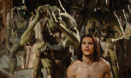
Disney's latest effort, 'John Carter' looks set to be one of the biggest box office flops ever, losing in the region of $200m. Who'd have thought that a plot about an American Civil War veteran, transported to Mars to fight in another (presumably more Martian) war, wouldn't hang together as a film? Unbelievable.


Once the film was complete, Disney must have realised that they'd got a problem. Rough cuts of films are tested to see if audiences like them and so that they can be tweaked to get a better final product. If feedback from that early research looked anything like the Rotten Tomatoes reviews of the film, then Disney will have known pretty early on that they had a failure on their hands.

Take this contribution, from the Guardian's Peter Bradshaw.


"I felt as if someone had dragged me into the kitchen of my local Greggs, and was baking my head into the centre of a colossal cube of white bread. "

Like Private Garlick in Good Morning Vietnam, "I have no idea what that means, Sir, but it sounds pretty negative to me."

Depending on which source you believe, Disney has spent somewhere between $50m and $100m marketing John Carter, almost certainly based on - at best - lukewarm pre-test results.

This never, ever, works. It's a golden rule of marketing that you cannot persuade a lot of people to buy a bad product by spending more on advertising. The first person who falls for it will tell all his mates that you lied and you've just wasted $100m.

In the end, this is a sign of whether a company really believes in research and is willing to follow through on the consequences of what they know. Any company that throws this amount of marketing money at a bad product, at its core, doesn't want to believe the research that it commissions. Disney hasn't just wasted $100m on marketing, it's wasted a smaller amount finding out ahead of release whether anybody likes their films too.