A lot of people are getting very excited about data again. Journalists particularly, seem to think they've spotted a new source of stories and are jumping on the 'Data Journalism' bandwagon.
The latest article to drop onto my Twitter feed - and the one that's prompted this post - is 'Data is the new black', accompanied by the now obligatory infographic that's not an infographic.
This latest surge of interest in (Big) Data is slightly different to the ones we've seen before. In the past, we've heard huge promises for what data analysis could deliver and then very often, nothing at all was delivered. To pick one example from the marketing world, 'Project Apollo' was rather expensive and never really made much progress. Data analysis projects often bogged down in the data assembly phase (they still do), without managers ever seeing much beyond PowerPoint decks that prophesied the arrival of data nirvana. Data nirvana being permanently around six months away, once we've sorted out a few teething problems. And could we have £40k for another database analyst to fix those teething problems please.
This time around, data is delivering some output. Recently, The Guardian had a very pretty interactive illustration of poverty rankings across UK regions, that would have been hard for a newspaper to put together even a couple of years ago. Tools like Google Fusion Tables and Tableau are making that data assembly phase more accessible and quicker to throw output at an audience. It looks like we might be getting somewhere.
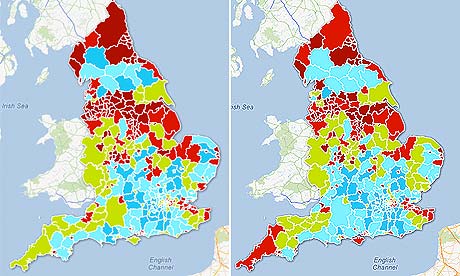
The Guardian's work is showing exactly where we're getting though and it's not quite the brave new world that some have promised. When you complete a major piece of analysis, you very often prove the answer that you were expecting in the first place. This isn't just true of social science, it works for classical scientific research too.
Think about what a scientist does, away from the media spotlight of a genuine breakthrough:
Is this a cure for the common cold? No. Is this? No. What about this? No. This one? Still no. It's not that we should stop looking but you can be 99% sure what the answer's going to be before you start.
The same happens with social science data like economic statistics and population demographics. When you examine them, largely, you prove what you already suspect. The Guardian's proved that the North of England is more deprived that the South. We knew that.
Examples of genuine revelations from marketing databases are hard to find and those that do surface are often dubious. The legendary nappies and beer example (diapers and beer if you're American) states that database analysts working for a major retailer noticed nappies and beer were often sold together. The story goes that young male parents often buy nappies on a Friday night and pick up a pack of beer at the same time, so cross marketing these two products is extremely effective. Take your pick on which retailer came up with it - Wal-mart, Tesco, ASDA - it's not actually true.
What data does let you do is to make a case more strongly. Data analysis helps us to move the foundations of a discussion from opinion, to fact, so that the discussion can move on to what we do about those facts. In marketing, if there's a widely held suspicion that a piece of advertising doesn't work, then it almost certainly doesn't, but very often it's not until you prove it, that the offending campaign will finally be pruned from the schedule.
It's never been about the data; it's about the question. Data can provide a stronger answer to a question than opinion alone and so if you ask the right questions, it will help to make a stronger argument. What it will never do is proffer insights of its own accord and it will rarely shock you in its conclusions. Those looking for epiphanies from analysis of Big Data, are likely to be disappointed.
The latest article to drop onto my Twitter feed - and the one that's prompted this post - is 'Data is the new black', accompanied by the now obligatory infographic that's not an infographic.
This latest surge of interest in (Big) Data is slightly different to the ones we've seen before. In the past, we've heard huge promises for what data analysis could deliver and then very often, nothing at all was delivered. To pick one example from the marketing world, 'Project Apollo' was rather expensive and never really made much progress. Data analysis projects often bogged down in the data assembly phase (they still do), without managers ever seeing much beyond PowerPoint decks that prophesied the arrival of data nirvana. Data nirvana being permanently around six months away, once we've sorted out a few teething problems. And could we have £40k for another database analyst to fix those teething problems please.
This time around, data is delivering some output. Recently, The Guardian had a very pretty interactive illustration of poverty rankings across UK regions, that would have been hard for a newspaper to put together even a couple of years ago. Tools like Google Fusion Tables and Tableau are making that data assembly phase more accessible and quicker to throw output at an audience. It looks like we might be getting somewhere.
The Guardian's work is showing exactly where we're getting though and it's not quite the brave new world that some have promised. When you complete a major piece of analysis, you very often prove the answer that you were expecting in the first place. This isn't just true of social science, it works for classical scientific research too.
Think about what a scientist does, away from the media spotlight of a genuine breakthrough:
Is this a cure for the common cold? No. Is this? No. What about this? No. This one? Still no. It's not that we should stop looking but you can be 99% sure what the answer's going to be before you start.
The same happens with social science data like economic statistics and population demographics. When you examine them, largely, you prove what you already suspect. The Guardian's proved that the North of England is more deprived that the South. We knew that.
Examples of genuine revelations from marketing databases are hard to find and those that do surface are often dubious. The legendary nappies and beer example (diapers and beer if you're American) states that database analysts working for a major retailer noticed nappies and beer were often sold together. The story goes that young male parents often buy nappies on a Friday night and pick up a pack of beer at the same time, so cross marketing these two products is extremely effective. Take your pick on which retailer came up with it - Wal-mart, Tesco, ASDA - it's not actually true.
What data does let you do is to make a case more strongly. Data analysis helps us to move the foundations of a discussion from opinion, to fact, so that the discussion can move on to what we do about those facts. In marketing, if there's a widely held suspicion that a piece of advertising doesn't work, then it almost certainly doesn't, but very often it's not until you prove it, that the offending campaign will finally be pruned from the schedule.
It's never been about the data; it's about the question. Data can provide a stronger answer to a question than opinion alone and so if you ask the right questions, it will help to make a stronger argument. What it will never do is proffer insights of its own accord and it will rarely shock you in its conclusions. Those looking for epiphanies from analysis of Big Data, are likely to be disappointed.