Monday, 19 December 2011

We need to talk about infographics

I blame Wordle. It's not fair to blame Wordle, but marketing's obsession with infographics got well out of hand at some point and I think it was around the same time that pretty word clouds came within reach of every bored account manager with a slide to fill.


I actually like Wordle a lot, so on second thoughts, maybe we should blame the infographic's leap to fame on marketing's discovery of Wordle rather than the tool itself, which has been around since 2008. A quick check of Insights for Search shows that the world went infographic mad a bit later than that, starting in 2009-2010.

Google searches for "infographic"


That growth line really isn't slowing down is it?

In case you hadn't guessed yet, this post is developing into a rant about infographics. To be more precise, infographics as they are used in marketing. I'm a little concerned though, that I may have just used an infographic to illustrate my point. Except that I'm pretty sure that's not what the image above is. It's a chart. If you're being pretentious, it's a data visualisation.

Data visualisations have a purpose; they exist to communicate data more effectively than text could. But could they still be the same thing as infographics? Maybe infographic is just short-hand for data visualisation?

Here's what Wikipedia thinks an infographic is...

"Information graphics or infographics are graphic visual representations of information, data or knowledge. These graphics present complex information quickly and clearly, such as in signs, maps, journalism, technical writing, and education. With an information graphic, computer scientists, mathematicians, and statisticians develop and communicate concepts using a single symbol to process information."

I really like the idea of the infographic as a sign. It differentiates it from a data visualisation and gives it a purpose. You could list all of the exits on this roundabout, with a paragraph for each that describes where they go, but you'd cause an accident as people tried, at 40mph, to read what you'd written. Infographics - by the Wikipedia definition - are useful to communicate a lot of information at a glance.


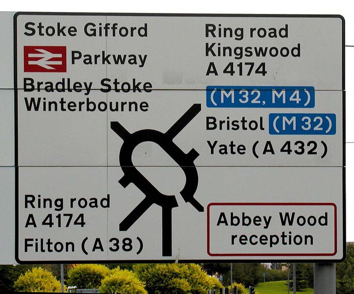
Let's be honest though, marketing infographics don't often look like that road sign. In marketing and journalism at least, the Wikipedia entry is out of date and the infographics we see today are a very long way from doing that job.

Let's pick on the IAB. That's not really a fair thing to do either, but they've been known to publish infographics and yesterday, they published this one.


Now that's a marketing infographic! Much more like it. Lots of charts all blended together into one big image and pretty typical of what you can see shared far and wide on Twitter every day.

It's quite pretty.

Probably took quite some time to draw.

My question is why draw it? Other than being link-bait for all those Google searches, what is an image like this for? Maybe it's art? Then it wouldn't need to be for anything, but I don't think it's art.

It needs a purpose, but I can't work out what its purpose is. For the time it takes to make one of these, it needs to be better at communicating than writing a short article and illustrating it with charts, but it just isn't. Infographics like this let you throw unstructured data at your audience (in a pretty format) in the hope that they'll draw some insights of their own from it. You're hoping that your audience will do the analysis for you.

In all honesty, I think this is what's been responsible for the infographic explosion. Facts are easy to get your hands on. They're everywhere. Original insight and analysis is hard and that makes the infographic perfect blog fodder. Take any topical subject, plus a bit of Googling for some relevant numbers, plus a few hours in Adobe Illustrator and you've got yourself some high grade link-bait.

Contrast the infographic above, with this lovely piece of data visualisation from The Guardian.


The Guardian's work makes a vast number of tweets more comprehensible than they would have been if you'd just thrown raw data about them at the viewer. The infographic on the other hand, throws large amounts of almost-raw data at the viewer.

Comparing between these two is undoubtedly unfair, as one is the product of a hell of a lot more work, but what's important for me is the scope of what they're trying to achieve. Only one attempts to aid your understanding of a subject. And only that one is worth your time and effort to decipher.

Feedback on this article from The Register, which recently started dabbling in infographics (the modern 'throw a lot of data at the page and see what sticks' versions) make me think that I'm not alone, but maybe you like the current direction? Have you seen any marketing infographics that you still find useful and refer back to? That did a better job than simply writing an article would have? I'd love to hear about them. Somebody's generating all those Google searches too, so if you're a sucker for an infographic, what is it about them that's so appealing?

Right now, the word infographic to me means "presenting data in a pretty format that makes it difficult to use" and until they go back to following that Wikipedia definition, I'll be steering well clear.

Tuesday, 8 November 2011

The other reason for Google+

I'll start this one with admission; I like and use a lot of Google's products. I've got an Android phone, have been singing the praises of Google+, Google's my default search engine and GMail is fantastic.

Like US
antitrust regulators though, I'm starting to wonder if Google might have too much power. If Microsoft had a case to answer in the way that Explorer was been bundled with Windows, then wouldn't Google have similar issues with the increasing integration between its products?

Google has a large suite of products, despite recently closing down
Labs and many of them are tied very closely to its search engine.


Search Google for any term that could reasonably return a map and you'll get a map included in the results. A Google map, naturally.

That's fair enough; I was looking for Leeds and Google fetched me a map of Leeds. Maps can probably be included in a legitimate list of the things I might have wanted. Unless you really want to get picky (and if you're
Streetmap, then you probably do,) all Google's really doing is returning a graphical result rather than a text based one.

The trouble with this type of justification, is that you can push it into almost any sphere that the web touches. And the web now touches virtually every part of our lives. If I want to do
anything then you can say that I'm looking to do it. Which means I'm searching for it. Which means it's a legitimate product for Google to develop and cross promote from its search engine.

This is exactly the argument that Eric Schmidt is
pushing with regulators in the US.


"[W]hat is crucial to understand is that universal search results are not separate 'products and services' from Google.

Rather, the incorporation of thematic and conventional results in universal search reflects Google’s effort to connect users to the information that is most responsive to their queries.

Because of this, the question of whether we 'favor' our 'products and services' is based on an inaccurate premise.

These universal search results are our search service — they are not some separate 'Google content' that can be 'favored'."
(Eric Schmidt. Quote borrowed from The Register)


Google's search market share in the UK is over 90% according to Hitwise. That's a hell of a lot of potential abuse of a dominant market position. I'm not saying that Google is abusing its position - the legal work on my house move is costing quite enough - but if everything Google builds can be integrated into search because it's all one product, then where do you stop? Taking a broad definition of the term, virtually everything starts with a search.

If want to know about a location then I need a map, Google has maps so Google directs me to its own maps.

If I need a flight, Google has a new flights product, so I can be sent there rather than to Skyscanner.

If I'd like to call someone, Google has phones and voice and video chat.

It's difficult to think of any service-based category that Google couldn't decide to enter, develop its own product, cross-promote it from search and use that same Eric Schmidt argument as a justification. Google Legal? Google Estate Agents? Music? News? Why not? You're searching for information and content.

As much as I like Google+, I missed one of its primary benefits to Google the first time around and it only became clear when the black product bar arrived, that now sits on top of just about all Google products.


By closely integrating their product offer - essentially by making it all one product - Google are playing the same game that Microsoft tried to play with Internet Explorer. Compare Schmidt's argument above, with this Microsoft justification for bundling Internet Explorer with Windows.

"Microsoft stated that the merging of Microsoft Windows and Internet Explorer was the result of innovation and competition, that the two were now the same product and were inextricably linked together and that consumers were now getting all the benefits of IE for free"
(Wikipedia link)

Sound familiar?

Microsoft ended up in a compromise with regulators, that was likely a much better outcome for them than if they'd just stubbornly refused to un-bundle Explorer from Windows.

Google seem to be playing the same strategy: Integrate your products so closely that you can argue they're not actually separate products at all. In that context, Google+ needs to be a window onto everything that Google does. It also explains why you'd ruthlessly kill off Labs, which might otherwise be cited as hosting examples of off-shoot products that have nothing to do with search.

Google won't get away from an antitrust investigation completely unscathed but it seems to be a good strategy to ape Microsoft and try to avoid a ruling that's heavily weighted against what they want to do as a business.

For their part, US regulators need to recognise Google+ for what it is: not just an aggressive move into social, but a very clever defensive move to counter a future antitrust ruling.

Friday, 4 November 2011

Book Review: Moneyball

Continuing Wallpapering Fog's series of occasional book reviews, we have Moneyball, a book about baseball statistics and a team called the Oakland A's that I picked up on the recommendation of @AdContrarian.

I know very little about baseball, other than that I watched a game on TV in a hotel room in New York once and found it quite dull. Before reading Moneyball, I'd never heard of the Oakland A's, but none of that matters. Moneyball is a stunning piece of work.


Baseball is the background for a story about how to change a business. The huge number of games that get played and the set-play nature of the games make baseball a statistical goldmine, where a few amateur analysts had noticed that a lot of long-standing, established wisdom about the game, was wrong.

One team - The Oakland A's - take this knowledge, which was freely available to anybody with an interest and set about building a team based on what they can prove about the tactics and the types of players that win games. They turn on its head the idea that the team with the highest paid players will always come out on top.

Michael Lewis works potentially dry statistics into a fabulous narrative, interspersed with the life stories of Oakland's oddball players, who don't look like athletes and would be rejected on any traditional evaluation of whether they're suited to the game. Overweight, old, injured and with bizarre throwing actions, they're mainstream baseball's rejects, but they've got stats that say they can hit...

As I read Moneyball, comparable problems from business, marketing and other sports kept jumping out. You find that you break from the page to wonder if the management at Stoke City FC have read it, or to curse (having worked for a year at EMI) that more people in the music industry haven't. You can't help wondering how many of our own established marketing practices are wrong and which ones we could prove definitely are. Baseball's brimming with statistics and yet the task of breaking established ways of doing things is incredibly hard, even when the evidence is staring you in the face. Marketing's a black art at the best of times, where it's much harder to produce the battering ram of hard stats that at least point the right way.

For me, as a statistician, Moneyball inspires, by showing just what can be achieved by dispassionate analysis and is daunting in its illustration of just how hard you have to work, to make the changes you've proved need to be made. Baseball went thirty years before anybody with money and control of a team paid attention to the hard evidence that established tactics and the usual metrics that were used to value players actually harmed your chances of winning.

Once one team picked up this knowledge and started to apply it (via a General Manager who couldn't care about who he needed to fire, intimidate or cajole to get his way), years went by before other managers started to ask how they were being consistently out-performed by a team with only a third of their player budget.

In short, read Moneyball. You don't need to know anything about baseball (though a little understanding of a few key terms, like base stealing, helps) and I promise by the time you've finished it, you'll want to make changes to the way that you work. It's the best non-fiction book I've read this year, by miles.

Tuesday, 25 October 2011

How to increase your marketing blog traffic

Want to know the secret formula for writing successful marketing blog posts? Then you've come to the right place.

If nothing else, this graphic might explain Wallpapering Fog's frequently disappointing traffic figures...


Monday, 17 October 2011

Chase success

You see this deceptively simple marketing question rear its head a lot, both in agencies and client side. I'd love to know what answer is taught on marketing courses, or even if a straight-forward answer is taught at all, because marketers seem to jump to the wrong conclusion so frequently.

The basis for my answer comes through in statistical models of marketing response, but also fits with a simple view of what can be achieved by marketing. For me, these are all fundamentally the same question:

"We've got a loyalty card and our card-holders don't often redeem their points for certain of the rewards on offer. Should we feature those rewards more prominently in the brochure to boost their take-up?"

"Most of the shoppers in this store come from the east side of town. Should we run some marketing in the west, to let those people know we're here?"

"Some of the holiday packages that we offer are selling much faster than others, should we 'fix' the under-performing ones by marketing them?"


The question being asked in all three of these is, "should I try to persuade people to do something that they don't seem to want to do, by marketing to them?"

The answer - nine times out of ten - is, "no; absolutely not."

It sounds obvious when the question is phrased like that, but think about how many times you've been asked to market an under-performing product, in order to 'fix' it.

Whether a product is selling or not is the single, best piece of market research that a marketer can lay his hands on. If it's not selling to a group of people, then they don't like it. Telling people about products that you already know they don't like, is just throwing your money away.

The basis for trying to boost an under-performing product comes from an over-estimate of the magic that marketing fairy dust can sprinkle onto a product and also a belief that the product you're selling should fundamentally appeal to a wide audience. Both of those come from being too close to the product that you're selling. People who aren't close to your product, who really don't care about your product but are being asked to buy it, have already told you what they think.

The only exception to this rule is if you can genuinely say that people might not be buying your product because they don't know about it. Before you decide that lack of awareness must be the issue and splash the cash on some marketing though, look at the products you've got that are selling. Do people really know that much more about those?

The reward card example I used above is a real one; the marketing team thought that more people should want to redeem their loyalty points for music CDs and wanted to push that message. Unfortunately, up to that point, music CDs hadn't been starved of marketing coverage compared to the other options available and people still weren't choosing music in large numbers. That's a loud and clear piece of the best market research money can buy. You offered free CDs to millions of people and only a few said "yes, please."

It's the same for the store that appeals to only one side of town. People on the other side either can't get to your store easily, or they don't want to. You can tell them all about where you are and they'll just keep on ignoring you.

For me, when a product is under-performing, you've got two options.

1. Save your money and stop pushing it.

2. Find a way to change the appeal of the product. (That's likely to be a product solution before it's a marketing one)

The reverse of all this gives a key piece of marketing advice. If you haven't completely saturated the market, then always chase success. Support your biggest sellers and make them even larger. People are telling you that they like these products - not just by saying nice things in focus groups, but by spending their own money on them. Your marketing will be much more effective if you listen.

Friday, 7 October 2011

Never let anyone tell you that it's too complicated to explain

Sayeeda Warsi was on BBC Question Time last night, giving the Conservative viewpoint on quantitative easing.


Baroness Warsi has a remarkable ability to get my back up at the best of times, but after an explanation of QE that didn't really make sense - to this economist at least - where she said that it "feeds demand... will keep interest low, mortgages low... and gets this country moving again," she went on to conclude that "it's complicated".

A lot of things are complicated. Dark Matter is complicated, but I saw a perfectly watchable Horizon programme about it last night. Econometrics is complicated too, but I don't try to sell it to clients, by rambling something about statistics and then saying "it's complicated".

Shortly after our ability to understand quantitative easing was dismissed with "it's complicated", @Natt tweeted this little gem.

"It's not complicated. You're just devaluing everyone else's money to keeps banks afloat."

And in one short sentence, swept away a tidal wave of bullshit.

Never, ever let anybody tell you that something is too complicated to explain. They're either avoiding telling you the truth, or as Einstein famously said,

“If you can't explain it to a six year old, you don't understand it yourself.”


Tuesday, 4 October 2011

Do you ever see a TV ad...

... and suspect that a creative had an idea that they've been just dying to dying to use somewhere? Anywhere? Pitched all over the place before finally, a brand agrees that a cartoon lady adrift on the ocean, who finds her cartoon twin on a desert island just screams "you really want to buy our tea."

It is a nice cartoon. Maybe I'm just too cynical.