So this year, I couldn't resist. Tableau set the challenge to build something - anything - with Wikipedia data and they've put prizes on the line. It's enough to tweak the competitive streak in any analyst...
But what to build? I started out with Football League data as it's familiar and I do a fair bit with those numbers already, but then@ChrisLuv did something really nice along the same lines and I got a bit bored scraping even more football results. It felt like time for a short break from football analysis and it would be nice to learn something new during the build.
I'm not sure where the Solar System idea that I've gone with came from - possibly a friend complaining recently on Facebook that his daughter keeps attacking his ship in Elite: Dangerous - but a quick browse on Wikipedia turned up nice, consistent datasets for planets and moons and some really lovely imagery. Definitely dashboardable.
I've been trying recently to reduce the numbers of screens in my Tableau work, because experience is showing that users can sometimes be reluctant to move around a multi-screen dashboard. If the landing page does a good job, you've got a good chance of converting new users to your interface, but if it requires more clicks to get to data, then things become much less smooth.
So, the task I set myself was a one page dashboard to explore the Solar System, and with enough interesting features to be worthwhile entering into the Iron Viz contest (I hope! That's not an intimidating task, honest).
Building on games like Elite, I also wanted it to look and feel something like the in-flight navigation computer in a space exploration game.
There's a bit of how-to guidance in the rest of this post, but first, here's the Hitchhiker's Guide to the Solar System...
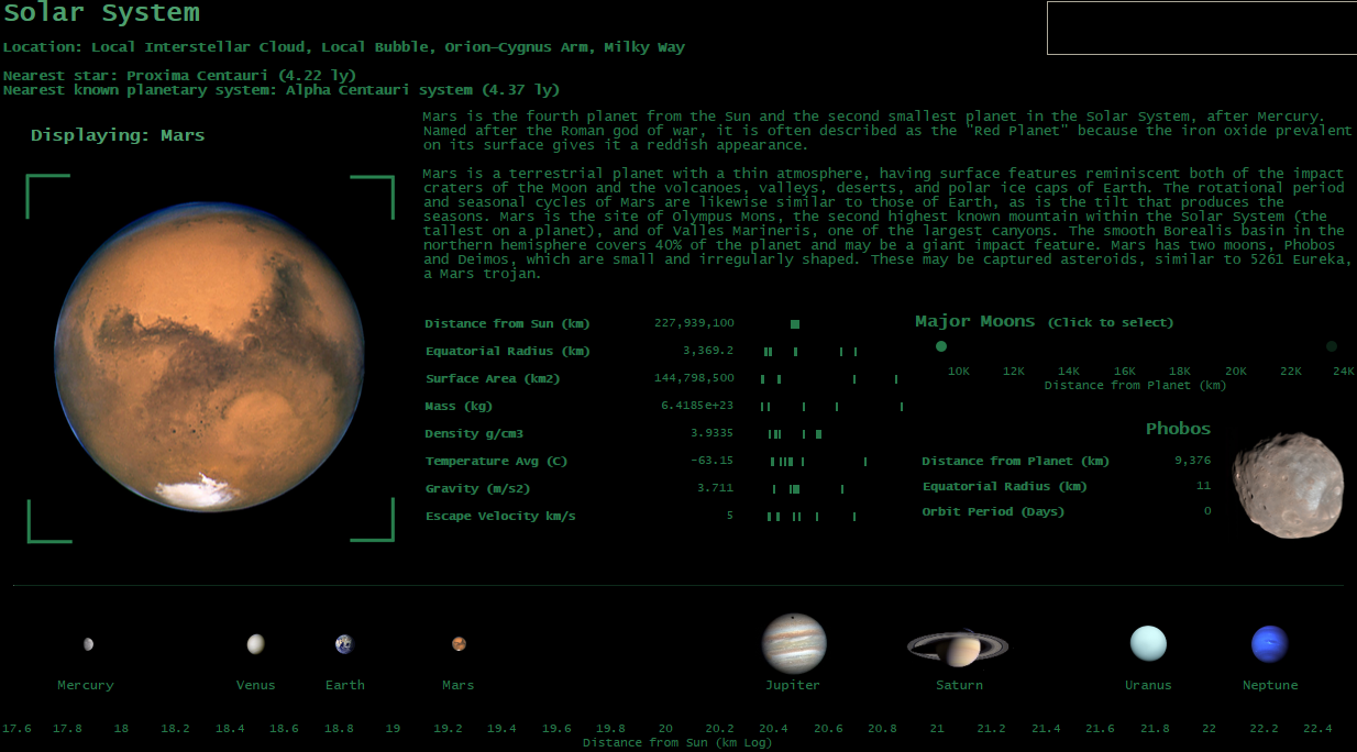
Navigation's a straightforward task of clicking the planet you want to see at the bottom of the screen and then you can also browse that planet's moons on the right-hand side.
If you really want to pull apart its inner workings, then download the workbook from Tableau Public and have a play. Here's a quick top-line guide to get things started.
Look and feel
Most of setting up the look and feel of the dashboard involved turning off features in Tableau. No axis lines, no grid lines, no titles for the dashboard elements, no tooltips and no row banding in tables. Everything was switched off via the Format menu and the background set to black everywhere.
If you set up one sheet the way you want it, then you can copy that sheet to make more without doing all of the formatting again. (P.S. Please can we have templates, Tableau? Pretty please?)
A green web-safe "Lucida Console" font on top of the black background gives a nice flight-computer feel.
Select a Planet
This is pretty easy once you know how Tableau custom shapes work.
I downloaded a high quality image (more on image quality later) of each planet from Wikipedia, saved them to my local Tableau shapes folder and then mapped them to the planet names.
The selector is a regular chart, with the axis set to logged distances from the Sun, planet images as shapes and planet sizes defined by their radius. Dashboard actions using that chart as a source, control the rest of the vis.
And a couple of extra tricks to tidy things up...
Large image of selected planet
This is done the same way as mapping shapes onto the 'Select a Planet' chart, right? Unfortunately not. You can do it that way, but it looks a bit rubbish, because Tableau compresses shapes to speed things up. If you blow them up too large, they look like this.

It's not totally unacceptable, but seems a real shame to lose those gorgeous high-resolution planet images from Wikipedia.
The trick to getting high resolution images that change on a filter, is to use Map - Background Images. You make a 1x1 scatter chart, with the planet image set to show as background, depending on what's selected on the filter. Don't forget to make the single data point on the chart transparent!
Here are the settings:


The 'target' surrounding the planet is just a floating png image with a transparent background. I drew the four corners in PowerPoint and exported them as a picture. As much as PowerPoint is the work of the Devil, it's a really quick, easy way to create simple coloured lines and add them to your dashboard!
Planet data
This one's easy. It's a straightforward table with a black background and all of the lines and other formatting turned off.
The little benchmarking chart to the right of the table is designed to provide some context. When you look at a statistic like 24.79m/s2 for Jupiter's gravity, is that a lot compared to the other planets?
The chart itself is a Gantt bar, with a dashboard action that highlights the currently selected planet and lets you quickly see how it compares to its neighbours. Using a percentage table calculation instead of absolute values lets us put all the planets on the same mini-chart and stops the ticks for huge "Mass" numbers, compressing everything else down towards zero.
Select a moon, to see data and image
We've seen these techniques before - it's exactly the same as the large planet image and planet data table. I used a simpler chart - without custom shapes - as the selector because some moons are very small and others have very similar orbits, so they can cluster closely together.
Gustav Holst. Just because we can.
This one's a bit of a cheat in that it's not data from Wikipedia, but I just couldn't resist.
Classical music and space games and movies go hand-in-hand, so I used a URL action to call Grooveshark's embedded music player with tracks from Gustav Holst's Planets Suite.
It's not really hard to do - click share on a Grooveshark track and pull the link out of the embed code that it generates. Add that link to your dataset.
Then drop an empty Web Page element onto your dashboard and create a URL action that calls the field containing the link. Tableau will automatically throw the link at the empty Web Page element when you make a selection.
Edit: I previously had some discussion here of issues with Tableau Public, when you try to embed a link to an http address. Thanks to @ChrisLuv you can safely ignore all of that and only need to know that you have to use an https web address for whatever you link to, in order for it to work properly in Tableau Public. Just switch "http" for "https" in whatever you link to and you should be fine.
There's a little warning message hidden underneath the Grooveshark player link, just in case the web browser that's viewing doesn't have flash enabled and so doesn't load the player, but most people should never see it.
I also put that warning text in a calculated field, that hides it when Earth is selected. Holst took inspiration for The Planets Suite from astrology and so there isn't a track for Earth. Wikipedia says so. See, I used Wikipedia data on Holst. It wasn't cheating after all!
And we're done. Phew. Fingers crossed, it's time to press submit on the entry...
But what to build? I started out with Football League data as it's familiar and I do a fair bit with those numbers already, but then
Building on games like Elite, I also wanted it to look and feel something like the in-flight navigation computer in a space exploration game.
There's a bit of how-to guidance in the rest of this post, but first, here's the Hitchhiker's Guide to the Solar System...
Navigation's a straightforward task of clicking the planet you want to see at the bottom of the screen and then you can also browse that planet's moons on the right-hand side.
If you really want to pull apart its inner workings, then download the workbook from Tableau Public and have a play. Here's a quick top-line guide to get things started.
Look and feel
Most of setting up the look and feel of the dashboard involved turning off features in Tableau. No axis lines, no grid lines, no titles for the dashboard elements, no tooltips and no row banding in tables. Everything was switched off via the Format menu and the background set to black everywhere.
If you set up one sheet the way you want it, then you can copy that sheet to make more without doing all of the formatting again. (P.S. Please can we have templates, Tableau? Pretty please?)
A green web-safe "Lucida Console" font on top of the black background gives a nice flight-computer feel.
Select a Planet
This is pretty easy once you know how Tableau custom shapes work.
I downloaded a high quality image (more on image quality later) of each planet from Wikipedia, saved them to my local Tableau shapes folder and then mapped them to the planet names.
The selector is a regular chart, with the axis set to logged distances from the Sun, planet images as shapes and planet sizes defined by their radius. Dashboard actions using that chart as a source, control the rest of the vis.
And a couple of extra tricks to tidy things up...
- The planet labels are on the second axis, so that they all display at the same height rather than each one hugging close to its own icon
- You can't use planet radius data exactly as it is to set the sizes of shapes, because Saturn has rings and so the planet itself ends up being too small. I created an extra field to boost Saturn's size up to where it should be.
Large image of selected planet
This is done the same way as mapping shapes onto the 'Select a Planet' chart, right? Unfortunately not. You can do it that way, but it looks a bit rubbish, because Tableau compresses shapes to speed things up. If you blow them up too large, they look like this.
It's not totally unacceptable, but seems a real shame to lose those gorgeous high-resolution planet images from Wikipedia.
The trick to getting high resolution images that change on a filter, is to use Map - Background Images. You make a 1x1 scatter chart, with the planet image set to show as background, depending on what's selected on the filter. Don't forget to make the single data point on the chart transparent!
Here are the settings:
The 'target' surrounding the planet is just a floating png image with a transparent background. I drew the four corners in PowerPoint and exported them as a picture. As much as PowerPoint is the work of the Devil, it's a really quick, easy way to create simple coloured lines and add them to your dashboard!
Planet data
This one's easy. It's a straightforward table with a black background and all of the lines and other formatting turned off.
The little benchmarking chart to the right of the table is designed to provide some context. When you look at a statistic like 24.79m/s2 for Jupiter's gravity, is that a lot compared to the other planets?
The chart itself is a Gantt bar, with a dashboard action that highlights the currently selected planet and lets you quickly see how it compares to its neighbours. Using a percentage table calculation instead of absolute values lets us put all the planets on the same mini-chart and stops the ticks for huge "Mass" numbers, compressing everything else down towards zero.
Select a moon, to see data and image
We've seen these techniques before - it's exactly the same as the large planet image and planet data table. I used a simpler chart - without custom shapes - as the selector because some moons are very small and others have very similar orbits, so they can cluster closely together.
Gustav Holst. Just because we can.
This one's a bit of a cheat in that it's not data from Wikipedia, but I just couldn't resist.
Classical music and space games and movies go hand-in-hand, so I used a URL action to call Grooveshark's embedded music player with tracks from Gustav Holst's Planets Suite.
It's not really hard to do - click share on a Grooveshark track and pull the link out of the embed code that it generates. Add that link to your dataset.
Then drop an empty Web Page element onto your dashboard and create a URL action that calls the field containing the link. Tableau will automatically throw the link at the empty Web Page element when you make a selection.
Edit: I previously had some discussion here of issues with Tableau Public, when you try to embed a link to an http address. Thanks to @ChrisLuv you can safely ignore all of that and only need to know that you have to use an https web address for whatever you link to, in order for it to work properly in Tableau Public. Just switch "http" for "https" in whatever you link to and you should be fine.
There's a little warning message hidden underneath the Grooveshark player link, just in case the web browser that's viewing doesn't have flash enabled and so doesn't load the player, but most people should never see it.
I also put that warning text in a calculated field, that hides it when Earth is selected. Holst took inspiration for The Planets Suite from astrology and so there isn't a track for Earth. Wikipedia says so. See, I used Wikipedia data on Holst. It wasn't cheating after all!
And we're done. Phew. Fingers crossed, it's time to press submit on the entry...
No comments:
Post a Comment