Building on my new-found love of network diagrams, I thought it would be fun to visualise a social graph of football analysts on Twitter.
Who should you follow? These guys. They're fascinating.
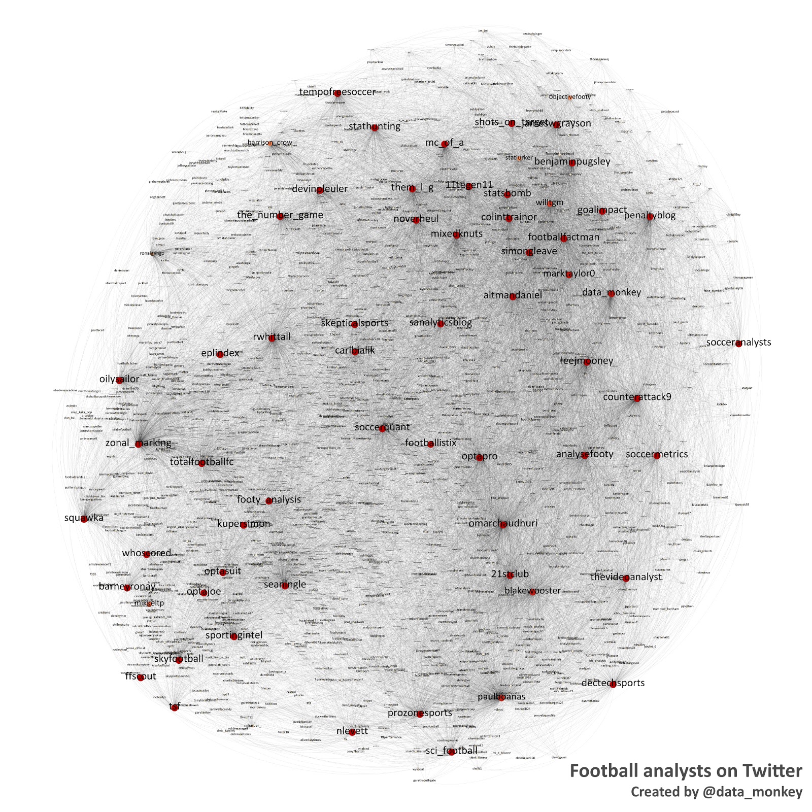
Click the image for a (much) bigger and zoomable version.
Small print:
Lots of users following each other moves those users' nodes closer together.
Following, replying to, or mentioning a user on Twitter gets you linked.
Nodes are sized by number of inbound links (i.e. shouting a lot and following lots of people doesn't get you a big circle, other people mentioning and following you does).
Twitter rate limits mean that once you hit a certain number of followers, you don't get any bigger. That's why all of the core people have nodes that are the same size.
This graph undoubtedly flatters my own profile because it's built from people I follow and talk to.
The starting point for the graph was Twitter users in this list. Who's missing? Let me know!
Who should you follow? These guys. They're fascinating.
Click the image for a (much) bigger and zoomable version.
Small print:
Lots of users following each other moves those users' nodes closer together.
Following, replying to, or mentioning a user on Twitter gets you linked.
Nodes are sized by number of inbound links (i.e. shouting a lot and following lots of people doesn't get you a big circle, other people mentioning and following you does).
Twitter rate limits mean that once you hit a certain number of followers, you don't get any bigger. That's why all of the core people have nodes that are the same size.
This graph undoubtedly flatters my own profile because it's built from people I follow and talk to.
The starting point for the graph was Twitter users in this list. Who's missing? Let me know!
No comments:
Post a Comment